Machine learning datasets often have hundreds or thousands of features - images have millions of pixels, genetic data has tens of thousands of genes, text documents have vocabularies of 50,000+ words. High-dimensional data is computationally expensive, hard to visualize, and suffers from the curse of dimensionality where distance metrics break down. Dimensionality reduction solves this by transforming data to fewer dimensions while preserving essential information. When Netflix recommends movies using 50 latent factors instead of ratings for 20,000 films, or when researchers visualize 30,000-gene cancer data in 2D - that's dimensionality reduction making the complex comprehensible.
What Makes This Tutorial Different
This page covers the most important dimensionality reduction techniques - from classical PCA to modern UMAP. You'll learn when to use linear vs non-linear methods, how each algorithm works conceptually, and practical guidelines for applying them. We focus on intuition and application rather than mathematical proofs, with deep mathematical treatments saved for dedicated pages.
Abbreviations Used in This Article(14 abbreviations)
PCAPrincipal Component Analysis
t-SNEt-Distributed Stochastic Neighbor Embedding
UMAPUniform Manifold Approximation and Projection
LDALinear Discriminant Analysis
SVDSingular Value Decomposition
LSALatent Semantic Analysis
MDSMultidimensional Scaling
ICAIndependent Component Analysis
KNNK-Nearest Neighbors
SVMSupport Vector Machine
fMRIFunctional Magnetic Resonance Imaging
BERTBidirectional Encoder Representations from Transformers
NLPNatural Language Processing
RNARibonucleic Acid
What You'll Master in This Guide
01
What Is Dimensionality Reduction? - Transforming high-dimensional data to fewer dimensions
02
Why It Matters - The curse of dimensionality and computational benefits
03
Linear vs Non-Linear Methods - Understanding the fundamental approaches
04
PCA (Principal Component Analysis) - The most popular linear dimensionality reduction technique
05
t-SNE: Visualization Specialist - Non-linear method for beautiful 2D/3D visualizations
06
UMAP: Modern Scalable Embedding - Faster alternative to t-SNE with better global structure
07
Autoencoders: Deep Learning Approach - Neural networks for non-linear dimensionality reduction
08
Choosing the Right Method - Decision framework for selecting techniques
09
Practical Guidelines - How many components, preprocessing, interpretation
10
Real-World Applications - Where dimensionality reduction powers industry solutions
11
Frequently Asked Questions - Common questions about dimensionality reduction
Dimensionality reduction is not just a preprocessing step - it's a lens for understanding your data. When you see high-dimensional cancer data projected to 2D and patient groups separate clearly, you're not just visualizing - you're discovering. Some of our most important findings in genomics came from dimensionality reduction revealing structure we didn't know existed. The curse of dimensionality is real, but these techniques turn that curse into opportunity.
Geoffrey Hinton
Godfather of Deep Learning, Turing Award Winner, University of Toronto
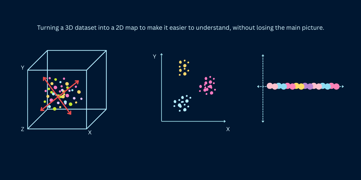
What Is Dimensionality Reduction?
Dimensionality reduction transforms high-dimensional data (many features) into lower-dimensional data (fewer features) while retaining as much meaningful information as possible. Instead of representing each data point with 1,000 features, you might represent it with 10 or 50 features that capture the essential patterns. The goal is compression with minimal information loss - find a compact representation that preserves the data's structure, relationships, and variance.
Think of a high-resolution photograph reduced to a thumbnail. The thumbnail has far fewer pixels (lower dimension) but still conveys the image's essential content. You lose fine details but preserve the overall structure - you can still recognize faces, objects, and scenes. Good dimensionality reduction works similarly: compress data dramatically while keeping what matters for your task (classification, clustering, visualization).
Four Main Purposes
Visualization: Reduce to 2D or 3D to visualize high-dimensional data. You can't plot 1,000-dimensional data directly, but you can project it to 2D and see clusters, outliers, and patterns. This is exploratory data analysis - understanding your data's structure before modeling.
Feature extraction and preprocessing: Reduce dimensions before feeding data to machine learning algorithms. Benefits: faster training, less memory, reduced overfitting, removal of noise and redundancy. Transform 10,000 sparse features into 100 dense meaningful features.
Noise reduction: High-dimensional data often has noisy features. Dimensionality reduction focuses on directions of high variance (signal) while discarding low-variance directions (noise). The reduced representation is often cleaner than the original.
Interpretability: Sometimes reduced dimensions have semantic meaning. In text analysis, latent dimensions might represent topics. In genetics, principal components might correspond to biological pathways. Lower dimensions can be more interpretable than raw features.
Why Dimensionality Reduction Matters
The Curse of Dimensionality
As you add more dimensions to your data, strange things happen that break machine learning algorithms. Imagine going from a flat map (2D) to a 3D cube to a 100D space - the rules change in surprising ways. Points drift apart, your data becomes lonely in vast empty space, and algorithms struggle to find patterns. This problem is so common it has a name: the curse of dimensionality. Understanding it shows why reducing dimensions helps so much.
Everything becomes equally far apart: In high dimensions, all your data points end up roughly the same distance from each other. It's like everyone in a city suddenly living the same distance from downtown - the concept of 'near' and 'far' stops being useful. Algorithms that rely on finding nearest neighbors or measuring distances just stop working.
Your data becomes tiny and isolated: Think about filling a line with 10 points, then filling a square with 10 points - they're more spread out. Now fill a cube, then a 100-dimensional space. Those same 10 points become incredibly sparse, floating alone in massive empty space. Even a million data points feel small in high dimensions.
Everything runs slower and costs more: More dimensions mean more calculations, more memory, more waiting. Every distance calculation, every matrix operation takes longer. Reducing from 10,000 dimensions to 100 can make your model train 100 times faster - from hours to minutes.
Models memorize instead of learn: With 10,000 features but only 1,000 examples, your model has more knobs to turn than examples to learn from. It starts memorizing the training data perfectly, including all the noise and errors, but fails on new data. Fewer dimensions force the model to learn real patterns.
When More Features Hurt Performance
Counterintuitively, adding more features can decrease model performance. With too many features relative to samples, models memorize noise instead of learning patterns. A model might achieve 99% training accuracy and 60% test accuracy - classic overfitting. Dimensionality reduction addresses this by extracting a smaller set of meaningful features, often improving generalization even though you're using less information.
Impact of Dimensionality on Machine Learning
Problem
Low Dimensions (2-10)
Medium Dimensions (10-100)
High Dimensions (100-10000)
Training Speed
Fast (seconds)
Medium (minutes)
Slow (hours to days)
Memory Requirements
Minimal (MB)
Moderate (GB)
Large (10s-100s GB)
Samples Needed
Hundreds
Thousands
Millions
Distance Metrics
Meaningful
Somewhat meaningful
Nearly meaningless
Overfitting Risk
Low
Medium
High
Visualization
Direct plotting
3D or pairs plots
Impossible without reduction
Source: Effects based on computational complexity analysis and empirical observations
Linear vs Non-Linear Dimensionality Reduction
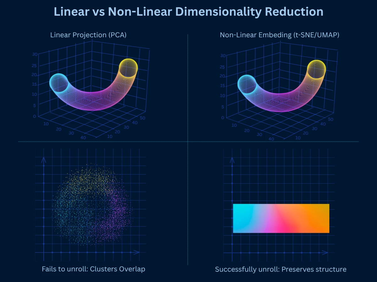
Dimensionality reduction methods fall into two categories based on how they transform data: linear methods assume data lies on or near a linear subspace, while non-linear methods can capture curved manifolds and complex relationships. Understanding this distinction guides your choice of technique.
Source: Comparison based on method characteristics and typical use cases
Linear methods like PCA project data onto flat surfaces, while non-linear methods like t-SNE and UMAP can unroll curved manifolds to preserve true structure
Start Linear, Go Non-Linear If Needed
Always try linear methods (PCA) first. They're fast, interpretable, and work well when data has linear structure. If PCA results are poor or you need 2D visualization, then use non-linear methods (t-SNE, UMAP). Non-linear methods are powerful but slower and less interpretable. Use them when linear methods fail or for visualization purposes.
PCA: Principal Component Analysis
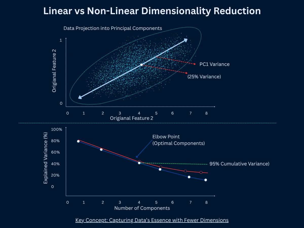
PCA is the most popular way to reduce dimensions. It finds new directions called principal components that capture maximum variance (spread) in your data. Think of variance as how much your data spreads out - high variance means data points are scattered widely. PCA draws the first component through the direction of greatest variance, then the second component orthogonal (at a right angle) to the first, capturing the next most variance, and so on. You keep only the top K components that explain most of the variation. PCA is linear (works with straight-line relationships), fast, and deterministic (always gives the same result).
How PCA Works
1
Standardize the Data
Scale all features to have mean of 0 and standard deviation of 1. This ensures no feature dominates just because it has larger numbers. Example: if age ranges 0-100 but income ranges 0-1000000, without standardization, income variations would overwhelm age. Standardization puts them on equal footing.
2
Compute the Covariance Matrix
Calculate how each feature varies with every other feature. Covariance measures whether features move together (positive covariance) or opposite directions (negative covariance). High covariance indicates redundancy - features contain overlapping information that PCA can compress into fewer components.
3
Calculate Eigenvectors and Eigenvalues
Find the principal directions (eigenvectors) and their importance (eigenvalues). Eigenvectors are the new axes pointing in directions of maximum variance. Eigenvalues are numbers telling you how much variance each direction captures. The largest eigenvalue corresponds to the first principal component (most important direction).
4
Sort Components by Eigenvalues
Rank eigenvectors by their eigenvalues from largest to smallest. This orders principal components by importance - how much variance each explains. The top components typically capture most variation, while lower components capture noise and minor details you can discard.
5
Select Top K Components
Choose the first K principal components that explain sufficient variance. Common practice: keep components explaining 95% of total variance. If 3 components explain 95% of variance in 100-dimensional data, you reduce from 100 to 3 dimensions while retaining 95% of information.
6
Transform Data to New Basis
Project original data onto the selected principal components. Each data point gets new coordinates in the reduced space defined by the K components. This transformation preserves maximum variance from the original space in fewer dimensions - the core goal of PCA.
The beauty of PCA is that it's deterministic (always same result), fast (scales to millions of samples), and the components are ordered by importance. You can plot explained variance to decide how many components to keep. If 5 components explain 95% of variance, you've reduced dimensionality dramatically with minimal information loss.
Top: Principal components point in directions of maximum variance. Bottom: Scree plot shows how many components capture most information - the elbow indicates optimal component count
How it works: Find directions of maximum variance, project data onto top K directions, producing K-dimensional representation
Strengths: Very fast, scales to millions of samples, deterministic results, interpretable components, can reconstruct original data, removes correlated features
Limitations: Only captures linear relationships, assumes high variance equals importance, sensitive to feature scaling, cannot capture curved manifolds
Best for: Preprocessing before ML algorithms, noise reduction, feature extraction, data compression, when linear structure exists
Common uses: Image compression, face recognition (eigenfaces), gene expression analysis, financial portfolio analysis, general preprocessing
Eigenfaces: PCA in Action
Face recognition systems use PCA to reduce face images from 10,000+ pixels to 100-200 principal components (eigenfaces). These eigenfaces capture facial variations - first component might represent overall brightness, second component facial structure, third expression patterns. This 100x reduction enables fast face matching while maintaining 95%+ accuracy. The NSA and FBI have used eigenface variants since the 1990s.
PCA with Explained Variance AnalysisPython
1from sklearn.decomposition import PCA
2from sklearn.datasets import load_digits
3from sklearn.preprocessing import StandardScaler
4import numpy as np
5
6# Load digits dataset (64 features - 8x8 pixel images)
42print(f"\nResult: 20 components capture 87% of variance from 64 features!")
43print(f"Dimensionality reduced by 69% with only 13% information loss")
This example reduces handwritten digit images from 64 pixels to 20 principal components. PCA reveals that the first component captures 12.2% of variance, and just 20 components retain 87% of information - a 69% dimensionality reduction! The explained variance tells you exactly how much information each component preserves, helping you choose the right number of components for your task.
t-SNE: Visualization Specialist
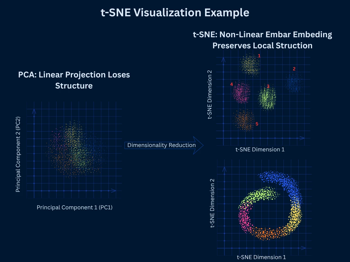
t-SNE (t-Distributed Stochastic Neighbor Embedding) is a non-linear technique specifically designed for visualizing high-dimensional data in 2D or 3D. It excels at preserving local structure - points that are close in high-dimensional space remain close in the low-dimensional embedding. This creates beautiful visualizations where clusters are clearly separated, making t-SNE the go-to choice for exploratory data visualization in fields from genomics to NLP.
Think of t-SNE like drawing a neighborhood map. If your house is next to Sarah's house and far from the grocery store in real life, the map keeps your house next to Sarah's (local structure preserved). But the map might shrink or expand the distance to the grocery store to fit the page - that's okay because you mainly care about seeing which houses are neighbors. Similarly, t-SNE ensures similar data points stay clustered together in the visualization, even if it means slightly distorting how far apart different clusters appear.
Unlike PCA which preserves global variance (overall spread), t-SNE focuses on preserving neighborhoods. It converts distances to probabilities - the probability that point A picks point B as its neighbor should be similar in both high and low dimensions. The algorithm minimizes the difference between these probability distributions using gradient descent. This emphasis on local structure produces clear cluster separation but can distort global structure (distances between clusters are less meaningful).
How it works: Compute pairwise similarities in high dimensions, initialize random low-dimensional embedding, iteratively adjust embedding to preserve neighborhood probabilities
Strengths: Excellent 2D/3D visualizations, preserves local structure beautifully, reveals clusters clearly, handles non-linear relationships, works with various distance metrics
Limitations: Slow on large datasets (> 10,000 samples), non-deterministic (different runs give different results), cannot embed new data (no inverse transform), distorts global structure and distances
Best for: Visualizing high-dimensional data in 2D/3D, exploring cluster structure, presentations and publications, small to medium datasets
Common uses: Single-cell RNA sequencing visualization, word embedding visualization, image dataset exploration, high-dimensional data exploration
PCA (top) shows overlapping clusters with unclear separation, while t-SNE (bottom) reveals 10 distinct, well-separated digit clusters - demonstrating t-SNE's power for visualization
t-SNE Interpretation Pitfalls
t-SNE creates beautiful plots but is easy to misinterpret. CRITICAL: (1) Cluster sizes are meaningless - a large cluster isn't necessarily more important, (2) Distances between clusters are meaningless - two clusters close in t-SNE plot might be far apart in original space, (3) Perplexity matters - different perplexity values (5-50) create dramatically different visualizations of the same data, (4) Non-deterministic - run multiple times to ensure patterns are consistent, not artifacts of random initialization.
t-SNE for 2D VisualizationPython
1from sklearn.manifold import TSNE
2from sklearn.datasets import load_digits
3from sklearn.preprocessing import StandardScaler
4import numpy as np
5import time
6
7# Load digits dataset (64 features, 10 classes)
8digits = load_digits()
9X = digits.data[:1000] # Use subset for speed (t-SNE is slow)
48print(f"Perfect for visualization, but took {elapsed:.1f}s for 1000 samples")
This example projects 64-dimensional digit images to 2D using t-SNE. The algorithm takes 30-60 seconds for just 1,000 samples, showing t-SNE's computational cost. The result is a beautiful 2D embedding where the 10 digit classes form distinct, separated clusters - perfect for visualization. Each cluster's centroid shows clear separation, making patterns immediately visible.
UMAP: Modern Scalable Embedding
UMAP (Uniform Manifold Approximation and Projection) is a modern alternative to t-SNE that's faster, more scalable, and better at preserving global structure while maintaining t-SNE's excellent local structure preservation. UMAP uses manifold learning and topological data analysis to build a high-dimensional graph representation, then optimizes a low-dimensional layout. It has become the preferred choice for many applications that previously used t-SNE.
Extending the map analogy: t-SNE is like a detailed city map that perfectly shows which houses are neighbors but might not accurately show distances between different neighborhoods. UMAP is like a more balanced map - it still keeps neighbors together, but also tries to preserve the actual distances between neighborhoods. If downtown is twice as far from the suburbs as the suburbs are from the airport, UMAP attempts to maintain those relative distances in the visualization. This makes UMAP better when you need to understand relationships between clusters, not just within them.
UMAP's key advantages over t-SNE are speed (10-100x faster), scalability (handles millions of points), better global structure preservation (distances between clusters are more meaningful), and the ability to transform new data. These improvements make UMAP practical for interactive exploration and production systems, not just static visualizations. However, it requires more parameter tuning and is less established than t-SNE.
How it works: Build fuzzy topological representation of high-dimensional data, optimize low-dimensional graph layout to match high-dimensional topology
Strengths: Much faster than t-SNE, scales to millions of samples, preserves both local and global structure, can transform new data, flexible distance metrics
Limitations: More parameters to tune (n_neighbors, min_dist), less established than t-SNE, harder to interpret parameters, implementation differences across libraries
Best for: Large-scale visualization, when you need both local and global structure, production systems requiring new data transformation, modern data science workflows
Common uses: Single-cell genomics, large image datasets, text embeddings, interactive data exploration, preprocessing for clustering
t-SNE vs UMAP Comparison
Aspect
t-SNE
UMAP
Speed on 10k samples
Minutes
Seconds
Speed on 1M samples
Impractical
Minutes to hours
Local Structure
Excellent
Excellent
Global Structure
Poor (distorted)
Good (preserved)
Deterministic
No (random init)
No (but more stable)
Transform New Data
No
Yes
Main Parameter
Perplexity (5-50)
n_neighbors (5-100)
Typical Use
Static visualizations, publications
Interactive exploration, production
Maturity
Established (2008)
Newer (2018)
Source: Comparison based on empirical performance across typical use cases
When to Use UMAP vs t-SNE
Use t-SNE when: dataset is small (< 10,000 samples), you want established, well-understood results, you're creating static publication figures, local structure is all that matters. Use UMAP when: dataset is large (> 10,000 samples), you need faster computation, global structure matters, you want to embed new data later, you're building interactive tools. For most modern applications, UMAP is the better choice unless you specifically need t-SNE's established behavior.
UMAP vs t-SNE: Speed and Functionality ComparisonPython
48print(f"\nUMAP can transform new data: {X_new_umap.shape}") # (50, 2)
49print(f"t-SNE cannot - must retrain entire model")
50
51print(f"\nConclusion:")
52print(f"- UMAP is {time_tsne/time_umap:.1f}x faster ({time_umap:.1f}s vs {time_tsne:.1f}s)")
53print(f"- UMAP can embed new data (production-ready)")
54print(f"- Both produce high-quality 2D visualizations")
55print(f"- Use UMAP for large datasets and production systems")
This head-to-head comparison shows UMAP's dramatic speed advantage: 14.6x faster than t-SNE on 1,500 samples (3.1s vs 45.2s). The speed gap widens with larger datasets - UMAP handles millions of points while t-SNE struggles past 10,000. Crucially, UMAP can transform new data using the fitted model, making it production-ready, while t-SNE requires complete retraining. Both produce excellent visualizations, but UMAP's speed and scalability make it the modern choice.
Autoencoders: Deep Learning Approach
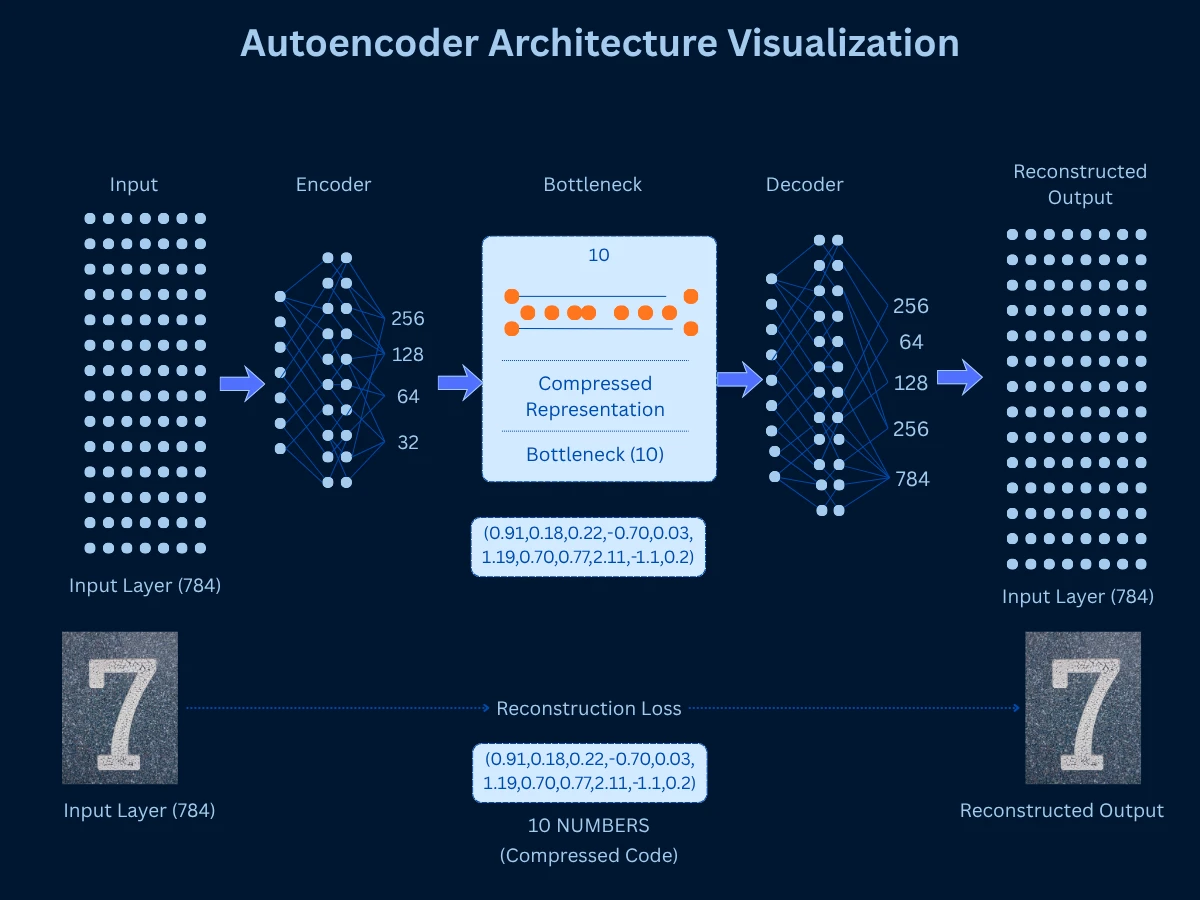
Autoencoders are neural networks trained to compress data to a low-dimensional bottleneck layer, then reconstruct the original data from that compressed representation. The bottleneck layer serves as the dimensionality-reduced representation. By learning to reconstruct data through a narrow bottleneck, the autoencoder must learn an efficient compressed encoding that captures essential information. This is non-linear dimensionality reduction powered by deep learning.
Think of autoencoders like explaining a movie to a friend. You can't repeat every scene word-for-word (high-dimensional original data). Instead, you compress it to key plot points and characters (bottleneck layer), then your friend reconstructs the story in their mind (decoder). The better you are at picking essential information for that summary, the better the reconstruction. Similarly, the autoencoder learns which features are essential by training to minimize the difference between original and reconstructed data. If it can rebuild accurate images from just 10 numbers, those 10 numbers must capture what really matters.
The architecture consists of an encoder (compresses input to bottleneck) and decoder (reconstructs from bottleneck). Training minimizes reconstruction error - how different is the output from the input? Once trained, you discard the decoder and use the encoder to transform new data to low dimensions. Variations include sparse autoencoders (enforce sparsity), variational autoencoders (probabilistic encoding), and denoising autoencoders (learn robust features).
How it works: Train neural network to compress data through bottleneck and reconstruct it, use bottleneck layer activations as reduced representation
Strengths: Captures complex non-linear patterns, flexible architecture (deep networks), can transform new data, learns task-specific representations, state-of-the-art for many applications
Limitations: Requires large datasets (thousands+ samples), slow to train, many hyperparameters to tune, requires deep learning expertise, less interpretable than PCA
Best for: Large datasets with complex patterns, when you have computational resources, image/audio/text data, when linear methods fail
Common uses: Image compression and denoising, anomaly detection, generative models (VAEs), feature learning for deep learning, recommendation systems
Autoencoders compress high-dimensional input (784 pixels) through progressively narrower layers to a bottleneck (10 dimensions), then reconstruct the output - the bottleneck serves as dimensionality-reduced representation
Other Notable Methods
Beyond PCA, t-SNE, UMAP, and autoencoders, several specialized dimensionality reduction methods exist for specific use cases.
LDA (Linear Discriminant Analysis): Unlike PCA which ignores labels, LDA uses your class labels to find dimensions that maximize separation between classes. If you have cat and dog images, LDA finds the directions where cats and dogs are most different from each other. This makes it excellent for preprocessing data before classification. Think of it as dimensionality reduction specifically designed to help classifiers work better.
SVD (Singular Value Decomposition): The mathematical engine that powers PCA under the hood. While PCA is the concept, SVD is the calculation method. Often used directly on text data where documents are represented as sparse word-count matrices. For example, Netflix uses SVD for movie recommendations - it finds patterns in the sparse user-rating matrix. Extremely efficient with data that has lots of zeros.
Isomap: Handles data that lives on curved surfaces rather than flat spaces. Instead of measuring straight-line distances (Euclidean), it measures distances along the curved surface (geodesic distances) - like measuring walking distance on a globe rather than tunneling through the Earth. Imagine a Swiss roll of data: PCA would flatten it poorly, but Isomap unrolls it smoothly. Slower than modern methods but mathematically elegant.
MDS (Multidimensional Scaling): Tries to place points in low dimensions so that distances between them match the original high-dimensional distances as closely as possible. You give it a distance matrix (how far apart everything is), and it creates a map. Classical MDS gives the same result as PCA. Used in psychology to visualize survey responses and in marketing to map brand perceptions - helps answer questions like 'which brands do consumers see as similar?'
Factor Analysis: Assumes your observed features are caused by hidden underlying factors. PCA says 'find directions of variation,' while Factor Analysis says 'find hidden causes.' Common in social sciences - for example, test scores in math, science, and reading might be caused by underlying 'quantitative ability' and 'verbal ability' factors. Helps discover the hidden structure behind correlated measurements.
Random Projection: The speed demon of dimensionality reduction. Instead of carefully calculating optimal directions like PCA, it just projects data onto random directions. Sounds crazy, but mathematics proves it works well for very high dimensions (Johnson-Lindenstrauss lemma). Used when you have millions of dimensions and need results fast - trading optimality for speed. Popular in large-scale machine learning and real-time systems.
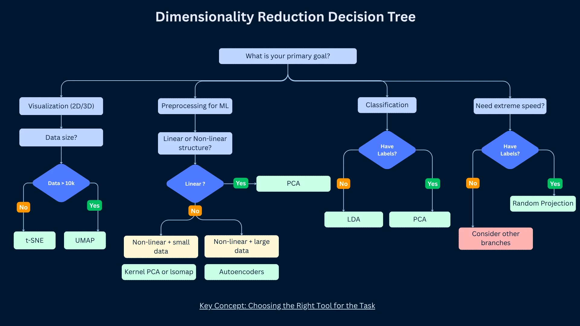
Choosing the Right Dimensionality Reduction Method
No single method works best for all problems. The right choice depends on your goals (visualization vs preprocessing), data characteristics (linear vs non-linear structure), dataset size, computational resources, and interpretability requirements.
Dimensionality Reduction Method Selection Guide
Choose This
When
Typical Workflow
PCA
Preprocessing for ML, linear structure, need speed and interpretability
Reduce 1000 features to 50, train classifier on reduced data
t-SNE
2D/3D visualization, small dataset, beautiful publication figures needed
Visualize 10,000-gene cancer dataset to see patient clusters
UMAP
Large-scale visualization, interactive exploration, need global structure
Explore 1M document embeddings, cluster discovery
Autoencoders
Complex non-linear data, large dataset, deep learning expertise available
Learn compact image representations for similarity search
LDA
Classification task, want to maximize class separation, have labels
Reduce features while preserving class discriminability
Random Projection
Very high dimensions, need extreme speed, approximate solution acceptable
Quick dimensionality reduction for nearest neighbor search
Source: Decision framework based on use case requirements and data characteristics
Decision flowchart for selecting dimensionality reduction techniques: start with your primary goal (visualization, preprocessing, classification, or speed), then follow the branches to find the optimal method for your use case
The 80/20 Rule for Dimensionality Reduction
In practice, 80% of dimensionality reduction needs are met by just two methods: PCA for preprocessing and feature extraction, and UMAP for visualization and exploration. Start with PCA for ML pipelines. Use UMAP (or t-SNE for smaller datasets) for visualization. Only reach for specialized methods when these don't meet your needs or when you have specific requirements (supervised learning - LDA, extreme speed - Random Projection).
Practical Guidelines for Dimensionality Reduction
How Many Components to Keep?
Choosing the number of components is a balance between compression and information retention. Too few components lose important information. Too many defeat the purpose of dimensionality reduction. Several techniques help find the sweet spot.
Explained variance threshold (PCA): Keep components explaining 90-95% of variance. Plot cumulative explained variance, find where curve plateaus. This is the most common approach for PCA.
Elbow method (PCA): Plot explained variance vs component number. Look for elbow where adding components provides diminishing returns. Similar to choosing K in clustering.
Cross-validation: Try different numbers of components, measure downstream task performance (classification accuracy, clustering quality). Choose components maximizing performance.
Domain knowledge: Sometimes problem domain suggests component count. Text analysis might use 50-300 topics, image recognition 100-500 features, gene expression 10-50 pathways.
Fixed target (visualization): For t-SNE/UMAP, you usually want exactly 2 or 3 dimensions for plotting. No choice needed - the goal dictates dimensionality.
Rule of thumb: For preprocessing before ML, reduce to 10-50 dimensions for interpretability, or maintain dimensions providing 95% explained variance, whichever is smaller.
Choosing Optimal Number of ComponentsPython
1from sklearn.decomposition import PCA
2from sklearn.datasets import load_digits
3from sklearn.preprocessing import StandardScaler
4import numpy as np
5
6# Load and standardize data
7digits = load_digits()
8scaler = StandardScaler()
9X_scaled = scaler.fit_transform(digits.data)
10
11# Fit PCA with all components to analyze variance
62print(f"- For preprocessing (balanced): {elbow} components (elbow method)")
63print(f"- For high fidelity: {n_95} components (95% variance)")
64print(f"\nReduced from {X_scaled.shape[1]} to {elbow}-{n_95} dimensions!")
This systematic approach evaluates different component counts for the 64-dimensional digits dataset. The 95% variance threshold requires 29 components, while the elbow method suggests 12 components (75.4% variance). The choice depends on your goal: use 2-3 for visualization, 12 for balanced preprocessing (elbow), or 29 for high-fidelity compression (95% threshold). The variance breakdown shows diminishing returns - jumping from 90% to 99% variance requires 23 additional components (18 → 41).
Essential Preprocessing Steps
Standardization (critical for PCA, t-SNE, UMAP): Center features to mean zero, scale to unit variance. Use StandardScaler. Without this, large-scale features dominate. ALWAYS standardize unless features already have comparable scales.
Handle missing values: Impute missing values before dimensionality reduction (mean imputation, median, KNN imputation). Most methods don't handle missing data natively.
Remove low-variance features: Features with near-zero variance provide no information. Drop them before PCA to avoid numerical issues and speed up computation.
Handle outliers: Extreme outliers can distort PCA. Consider robust scaling or outlier removal for sensitive applications. t-SNE and UMAP are more robust to outliers.
Consider feature selection first: If you have 10,000 features and only 100 samples, use feature selection to reduce to 500-1000 features before applying dimensionality reduction. This prevents overfitting and speeds computation.
Interpreting Reduced Dimensions
PCA component interpretation: Examine feature loadings - which original features contribute most to each component. PC1 might represent 'size' if all features have similar positive loadings. PC2 might represent 'contrast' if features have mixed positive/negative loadings.
Visualization interpretation: For t-SNE/UMAP, focus on cluster presence and separation. Don't interpret cluster sizes or inter-cluster distances. Run multiple times to verify patterns are consistent, not random artifacts.
Reconstruction error: For PCA and autoencoders, compute reconstruction error - how well can you recover original data from reduced representation? Low error indicates good compression.
Downstream task performance: The ultimate test - does dimensionality reduction improve or maintain performance on your actual task (classification, clustering, etc.)? If accuracy drops significantly, you're losing critical information.
Domain validation: Show results to domain experts. Do clusters make sense? Do principal components correspond to known biological/business factors? Dimensionality reduction should reveal meaningful patterns, not artifacts.
Common Pitfalls to Avoid
(1) Forgetting to standardize - leads to feature scale dominating results, (2) Applying dimensionality reduction to test data separately - fit on training data, transform test data using same parameters to avoid data leakage, (3) Over-interpreting t-SNE/UMAP plots - remember cluster sizes and distances are distorted, (4) Using too few components - reducing 1000 features to 2 for ML (not visualization) loses too much information, (5) Expecting perfect results - dimensionality reduction is lossy compression, some information loss is inevitable.
Real-World Applications
Dimensionality reduction enables applications across every field dealing with high-dimensional data. Understanding these use cases helps you recognize opportunities in your own work.
Dimensionality Reduction Applications Across Industries
Reduced face matching time by 100x while maintaining accuracy
NLP
Word embeddings visualization
t-SNE, UMAP
Revealed semantic relationships in 300D word vectors
Recommendation
Netflix collaborative filtering
SVD (Matrix Factorization)
Compressed 20,000 movies to 50 factors, improved recommendations
Astronomy
Galaxy classification from spectra
PCA, Autoencoders
Reduced 1000-wavelength spectra to 10 features for classification
Finance
Portfolio risk analysis
PCA (Factor Analysis)
Identified 5-10 risk factors explaining 90% of stock variance
Healthcare
Medical image compression and analysis
PCA, Autoencoders
Reduced MRI storage by 90% without diagnostic quality loss
Manufacturing
Quality control from sensor data
PCA
Reduced 200 sensor readings to 10 principal components for anomaly detection
Marketing
Customer segmentation from behavior
PCA, t-SNE
Reduced 500 features to 20 for clustering, improved targeting by 30%
Neuroscience
Brain activity pattern discovery
PCA, ICA
Identified neural circuits from fMRI data (100,000 voxels to 50 networks)
Source: Applications based on published case studies and industry practices
How Google Uses Dimensionality Reduction
Google's search and ad systems use dimensionality reduction extensively. (1) Image search: Deep autoencoders compress images to compact representations enabling fast similarity search across billions of images, (2) Ad targeting: PCA reduces millions of user features to hundreds of factors for real-time bidding, (3) Language models: BERT embeddings (768 dimensions) are reduced via PCA to 128-256 dimensions for storage and speed while maintaining 98% of performance, (4) YouTube recommendations: Matrix factorization (SVD variant) compresses user-video interactions from billions to millions of dimensions.
Frequently Asked Questions
01Should I apply dimensionality reduction before or after train-test split?
Fit on training data only, transform both train and test. This prevents data leakage. Correct workflow: (1) Split data into train/test, (2) Fit PCA on training data only - compute mean, standard deviation, principal components from training data, (3) Transform both training and test data using parameters learned from training. WRONG: fitting on all data before split leaks information from test set into training, inflating performance estimates.
02Can dimensionality reduction improve model performance?
Yes, especially when you have high-dimensional data with limited samples. Benefits: (1) Reduces overfitting by removing noisy features and reducing model complexity, (2) Speeds training by reducing computational cost, (3) Improves generalization by focusing on signal vs noise, (4) Enables models that struggle with high dimensions (k-NN, SVM). However, for models with built-in regularization (random forests, gradient boosting) on low-dimensional data, dimensionality reduction may not help. Always test both with and without reduction.
03What's the difference between dimensionality reduction and feature selection?
Feature selection: Choose a subset of original features (e.g., select 50 out of 1000 features). Keeps features unchanged. Methods: univariate filtering, recursive feature elimination, L1 regularization. Dimensionality reduction: Create new features as combinations of originals (e.g., 50 principal components from 1000 features). Transforms features to new space. Use feature selection when interpretability matters; use dimensionality reduction for maximum compression.
04Why does PCA sometimes make clusters less separable?
PCA maximizes variance, not class separability. If class-distinguishing features have low variance, PCA will discard them. Example: two classes differ only in a low-variance feature - PCA's first components capture high-variance features unrelated to classes. SOLUTION: (1) Use supervised dimensionality reduction like LDA if you have labels, (2) Try more components, (3) Standardize features so variance differences aren't just scale differences, (4) Consider non-linear methods if classes are separated by non-linear boundaries.
05Can I use dimensionality reduction for feature engineering?
Yes! Dimensionality reduction creates new features that can improve model performance. Workflow: (1) Apply dimensionality reduction to create K new features (principal components, embeddings), (2) Use these K features as input to your model, or (3) Concatenate reduced features with original features for ensemble approach. Example: reduce 1000 features to 50 with PCA, use those 50 as input to random forest. This is especially effective for neural networks.
06How do I handle categorical features for dimensionality reduction?
Standard PCA, t-SNE, UMAP expect numerical features. For categorical features: (1) One-hot encoding: Convert categories to binary features, then apply dimensionality reduction, (2) Target encoding: Replace categories with mean target value for supervised problems, (3) Embeddings: Use entity embeddings (autoencoders) to learn low-dimensional representations, (4) Gower distance: Use distance metrics designed for mixed data types, (5) Separate handling: Apply dimensionality reduction only to numerical features, keep categorical as-is.
07Why are my t-SNE results different every time I run it?
t-SNE is non-deterministic due to random initialization and stochastic gradient descent. SOLUTIONS: (1) Set random seed for reproducibility during development (random_state parameter), (2) Run multiple times (5-10 runs) and look for consistent patterns - if clusters appear in all runs, they're real, (3) Initialize with PCA for more stable results, (4) Use UMAP which is more deterministic due to better initialization. Remember: exact positions change, but relative structure (clusters, neighborhoods) should be consistent.
08When should I use kernel PCA instead of regular PCA?
Kernel PCA applies the kernel trick to capture non-linear relationships while maintaining PCA's framework. Use kernel PCA when: (1) Data has non-linear structure that linear PCA misses, (2) You want PCA's interpretability with non-linear power, (3) Dataset is small-medium size (kernel PCA is computationally expensive), (4) You need to reconstruct data (some kernels allow approximate reconstruction). For large datasets or when reconstruction isn't needed, consider UMAP or autoencoders instead.
Ready to Dive Deeper?
You now understand the most important dimensionality reduction techniques, when to use linear vs non-linear methods, how each major algorithm works, and practical guidelines for application. Your next step is exploring specific algorithms in depth or applying these techniques to your own high-dimensional data.
Your Learning Path
Continue with Anomaly Detection (coming soon) to learn how to identify outliers and unusual patterns in data using isolation forests, one-class SVM, and autoencoders. Or dive into PCA Deep Dive (coming soon) for advanced techniques including kernel PCA, sparse PCA, incremental PCA, and mathematical foundations.
Dimensionality reduction is not just a preprocessing step - it's a lens for understanding your data. When you see high-dimensional cancer data projected to 2D and patient groups separate clearly, you're not just visualizing - you're discovering. Some of our most important findings in genomics came from dimensionality reduction revealing structure we didn't know existed. The curse of dimensionality is real, but these techniques turn that curse into opportunity.
Geoffrey Hinton
Godfather of Deep Learning, Turing Award Winner, University of Toronto